The Feed Overhaul and Dark Mode are here

The Feed Overhaul and Dark Mode are here

Manuel Becker Manuel Becker in Changelog
16.04. · 1 min read

It’s been a busy few weeks behind the scenes at Locationscout. As photographers, we all know that presentation is everything. Whether it’s the way light hits a landscape or the way a photo is framed on a screen, the details matter.

That’s why I’m incredibly excited to finally pull back the curtain on the next big update to the platform.

The New Feed

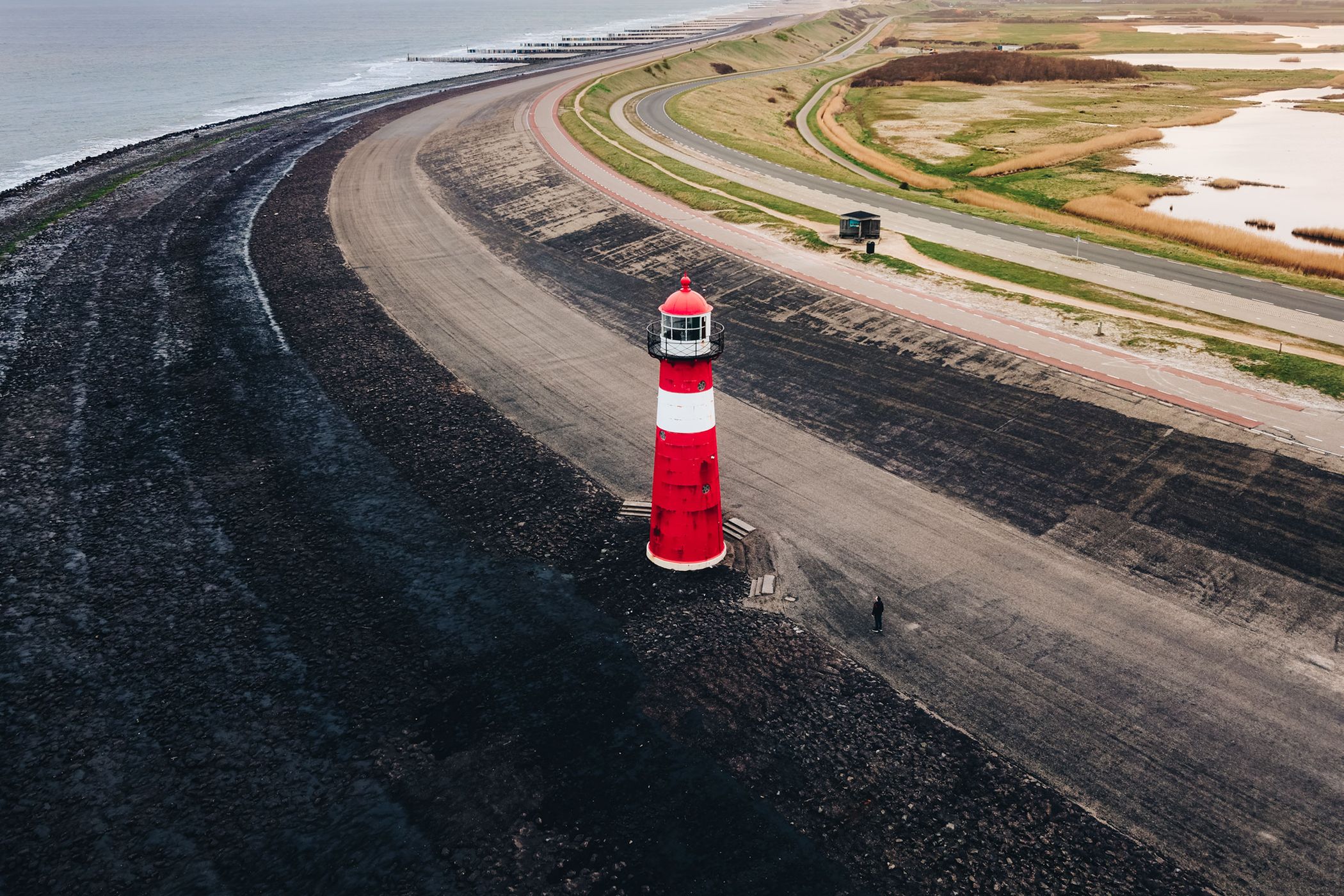
The core of Locationscout has always been the incredible imagery shared by this community. I felt the old feed wasn't doing those shots justice anymore.

I’ve redesigned it to be larger, bolder, and more modern, but in a subtle way without a complete rework. The new layout gives your photos more room and uses a refined design language that makes browsing for your next photo spot a much more immersive experience. Fewer lines and layers - more focus on the beautiful photos.

Dark Mode

I originally only intended to build a "Dark Mode" toggle for the feed as a quick evening side project... but that escalated quickly.

As soon as I saw how good the photos looked against a dark background, I couldn't stop. That "small update" quickly turned into a deep dive into the entire platform. I’ve spent the last few weeks reviewing almost every template and fine-tuning dozens of icons to ensure they look crisp and intentional, whether you’re browsing in the light or the dark. There is a new switch in the top right with a subtle animation.

Dark Mode is now available across the entire website. It’s easier on the eyes during those late-night editing sessions and, in my opinion, makes the colors in your photography truly pop.

I Want to Hear From You!

Locationscout has always been built for the community, and I want to know what you think of these changes.

  • How does the new feed feel to you?
  • Are there any specific areas where Dark Mode needs a bit more polish?
  • Is there a specific feature you’d love to see redesigned next?

And the most important question: Are you Team Light or Team Dark?

Drop a comment below or send me an email. I’m all ears and ready to keep refining this home for our photography.

Thank you for your thoughts, and I hope you are having a great year so far. Manuel

Comments (15)

Please log in or sign up for free to leave a comment or ask a question.
Rudolf Zoechling
Rudolf Zoechling 26.04.
Hi Manuel, thanks for the dark mode, the pictures look much better here, I'm on team "dark mode" ...liebe Grüße aus Österreich
Manuel Becker Team
Manuel Becker 26.04.
Thank you Rudolf, I really appreciate your opinion. Glad that you like dark mode as much as I do. Liebe Grüße aus dem Rheinland ins wunderschöne Österreich :-)
Marcelo Aguilar
Marcelo Aguilar 20.04.
Thanks Manuel for this timely update. In my opinion, dark mode is much better for highlighting the colors in a photograph. The screen's whites are harsh and end up tiring the eyes.
Manuel Becker Team
Manuel Becker 20.04.
Thank you for your opinion dear Marcelo. I absolutely agree and it was annoying me for quite some time as well because I always use dark mode everywhere. It's crazy how much effort it is to rework an entire platform with dark mode if you want to find the perfectly matching colors where in dark mode, they usually become always lighter compared to the background, while in light mode, you have 2 directions to go by making backgrounds lighter to highlight them or darker to reduce the attention.
O Leão Do Atlântico - The Atlantic Lion
O Leão Do Atlântico - The Atlantic Lion 17.04.
Amazing Manuel, now I can take pictures of the far side of the moon with my Nikon Z9, which spent some time in space just a few days ago. Best regards from AZORES.
Manuel Becker Team
Manuel Becker 17.04.
That's such a perfect ad for Nikon. Glad that you like the changes and I can't wait for your "far side of the moon" photos... ;-)
Edward
Edward 17.04.
Definitely prefer dark mode. I've been looking at some of the other features I haven't explored properly... Themes and Map are excellent - thank you.
Manuel Becker Team
Manuel Becker 17.04.
I guess I added too many features this year already ;-) Definitely check the image grid... It's one of my favorite features that the app already has, and I really wanted to have it for the website too because it's so powerful and makes exploring so much more fun.
Nico Trinkhaus
Nico Trinkhaus 17.04.
Fantastic improvement! Team Dark on my end.
Manuel Becker Team
Manuel Becker 17.04.
Thank you, so glad that you like it. Your colorful photos stand out even more in dark mode!
Niko Kersting
Niko Kersting 17.04.
Tasteful and modern. Well done.
Manuel Becker Team
Manuel Becker 17.04.
Thank you dear Niko, I really appreciate it. If you feel anything could be even better, feel free to reach out at any time.
Rob Pillar
Rob Pillar 17.04.
Bravo, Manuel! I appreciate your improvements. They greatly enhance the experience!
Manuel Becker Team
Manuel Becker 17.04.
Thank you Rob. Do you prefer light or dark mode?
Rob Pillar
Rob Pillar 17.04.
I much prefer dark mode—the colors pop.
Imprint & Contact © Locationscout 2026 Privacy / Terms